design systems • design ops — tooling • BrandingMulti-Branded workflow improvement
Product teams could create a product once, and brand it in any way they needed. Here’s how we made that process scale.
~200%
productivity increased for Design System and Product Teams
71%
improvement to accessibility scores
100+
brands with WCAG compliant themes
~1800%
annual brand adoption rate increase from the previous year
primary objectiveImprove Workflow for New Theme Creation & Increase Design System Adoption
Bayer’s Marketing Platforms in both the Pharmaceutical and Crop Science divisions which boasted over 100 brands were in need of a way to design a templated experience that could be reiterated and rebranded as quickly as possible. Theme creation time to launch was becoming a bottle neck, with themes taking 6 weeks on average to deliver end-to-end. The Theme creation workflow needed to be optimized not only for the Design System team to create but also for the Product teams to implement.
Goals-
Must be Consistent & Quick
Experiences should be templated and easily recreated. The Marketing Platform uses AEM, so themes must be compatible. Brand integrity must be prioritized.
-
Themes must be approved by brand manager
Users should be able to save time getting approval on Look & Feel. A product should be fully branded out of the box.
-
Must meet WCAG Accessibility Compliance
Each background color must be paired with AA compliant options for large text, small text, icon, and interaction.
-
Must Simplify Workflow
Theme creation could take anywhere from 4 sprints to 6 months depending on the complexity of the brand. We had to establish a faster launch model while juggling staffing changes.
roleTheme Team Lead
As the Theme Team Lead, I facilitated workshops, delivered extensive documentation, evangelized new Element capabilities, created onboarding materials, streamlined and built guidelines for Standard Operating Procedures, and assisted in both long-term and short-term strategies.
An Opportunity to Make a Difference
With the arrival of the new Element Design System, users who had already built products became anxious about losing exiting work. Themes had become the most intuitive and reliable aspect of Element Design System and would be quick to implement in the new, migrated system.
Creating a collaborative space to give users an opportunity to have real impact on the tools they would be using became the flame that would attract adopters to the new system.
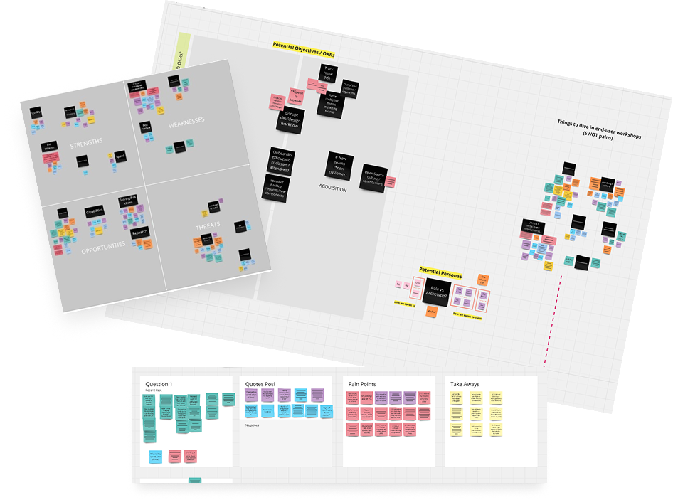
Research Phase
We curated a list of power users, squeaky wheels, and enthusiastic collaborators to gather in a room for 1:1 interviews and regular check-in surveys. With the help of our users, we committed to data-driven change in our iterative improvements for the Element Design System.
Main Findings:Cost was blocking adoption: Level of effort varied theme to theme but cost didn’t scale in the same way, causing teams to pay more but getting less
Newer Users Struggled with Nuanced Branding: Flexibility was conflicting with consistency for users less familiar with our products
Accessibility scores were good, but could be better: We had provided a number of background and foreground colors, but our interactive elements were sometimes falling behind
Contribution process was confusing and too slow: Users felt overwhelmed and abandoned when it came to contributing to the design system in any meaningful way
Concept to launch for new themes was too slow: Tedious and abundant touch points for creating new themes was creating a bottle neck for Product Teams
Our Solutions
-
Scale Cost to Level of Effort
We created a new billing model that lowered cost for products and teams that needed less bespoke branding
-
Simplify Governance and Contribution
We created a portal, accessible from our Design System website where users could collectively request and vote on systematic changes
-
Accessibility Improvements
Introduced new considerations and checkpoints for accessibility compliance
-
Provided Documentation and Up-Skilling Resources
We made guidance easier to find and easier to follow with improved documentation. Workshops and DIY learning tools grew Bayer’s collective design system knowledge
-
Automated and Streamlined Time-Intensive Tasks
Token consolidation and plug-in creation accelerated our theme creation productivity by nearly 200%
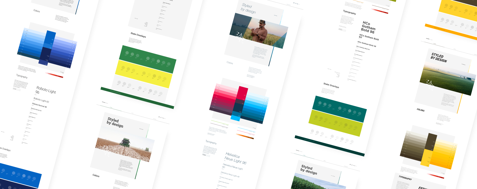
Not all themes have the same levels of complexity, which meant they have separate levels of cost and effort. To solve this issue, we created three different theme categories. This categorization breakdown gave us and our stakeholders a clearer understanding of expectation and limitation. It also prevented feedback cycles from going around and around, and forced every meeting into productive and actionable conversation.
Theme Categories
Basic
1 Sprint Theme
Up to 9 brand colors
Open source font
Default look and feel
Typography Hierarchy
Limited to Design System’s current capabilities
Advanced
Minimum 2 sprint theme
Up to 9 brand colors
Licensed font (with cost)
Typography Hierarchy
Custom Brand Expression within Element’s limitations
Innovative
Sprint term defined by discovery period
Custom Palette
Custom Brand Expression
Custom Components (with cost)
Capability exploration
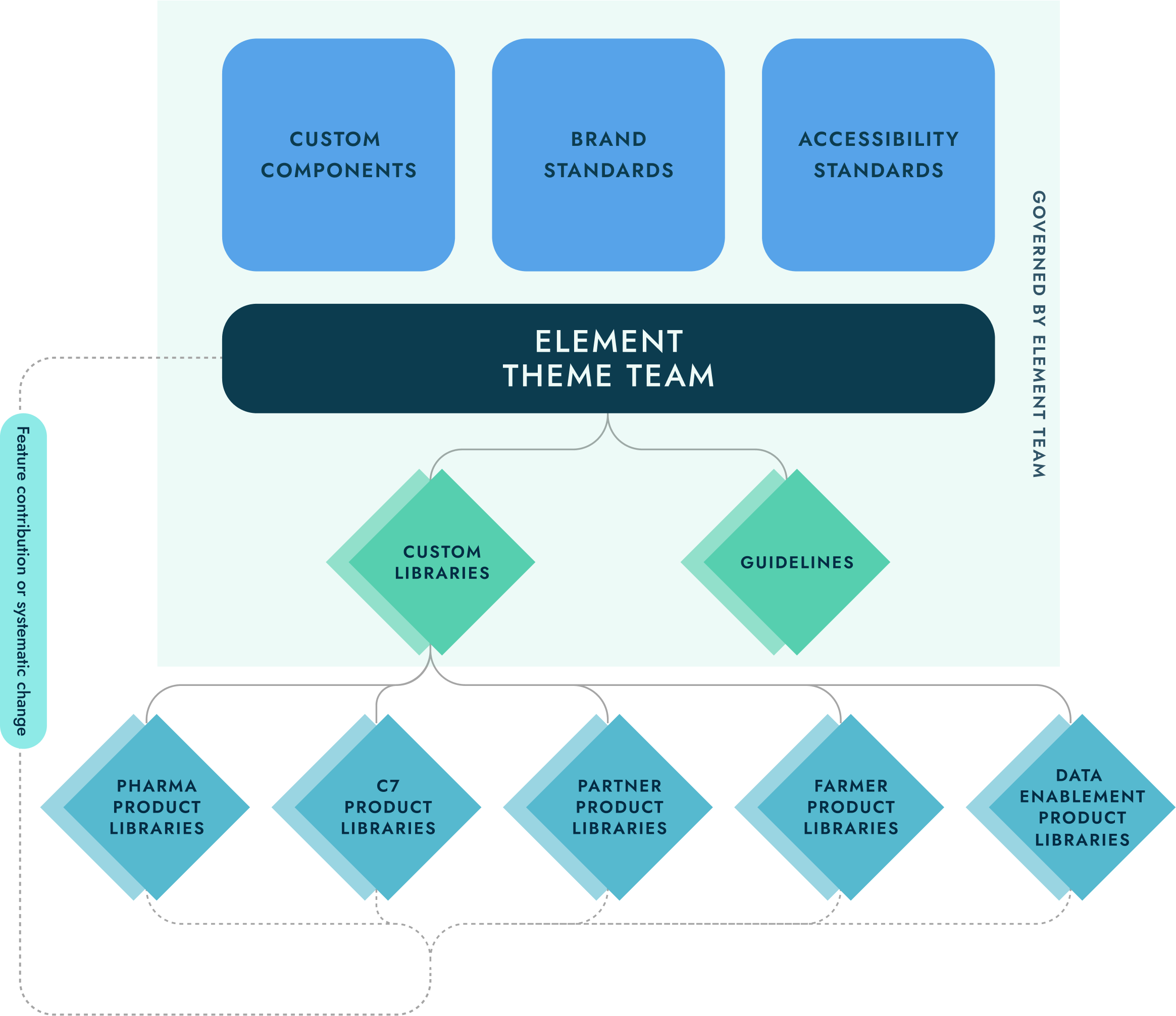
Governance & Contribution Model
It all starts with Element in our hybrid governance model. A central team facilitates and distributes any brand standards or changes to the Bayer Theme. Brand Integrity and accessibility standards are built into each component to be inherited by any supported products. Any changes are requested and evaluated by the design system team to determine impact and feasibility before being contributed back into the system for anyone to use.
Builds community and trust between design system team and users
Product Level Libraries allow for flexibility while also improving consistency for the brand
Reduces roadblocks and dependencies from the design system team
Tooling & Resources
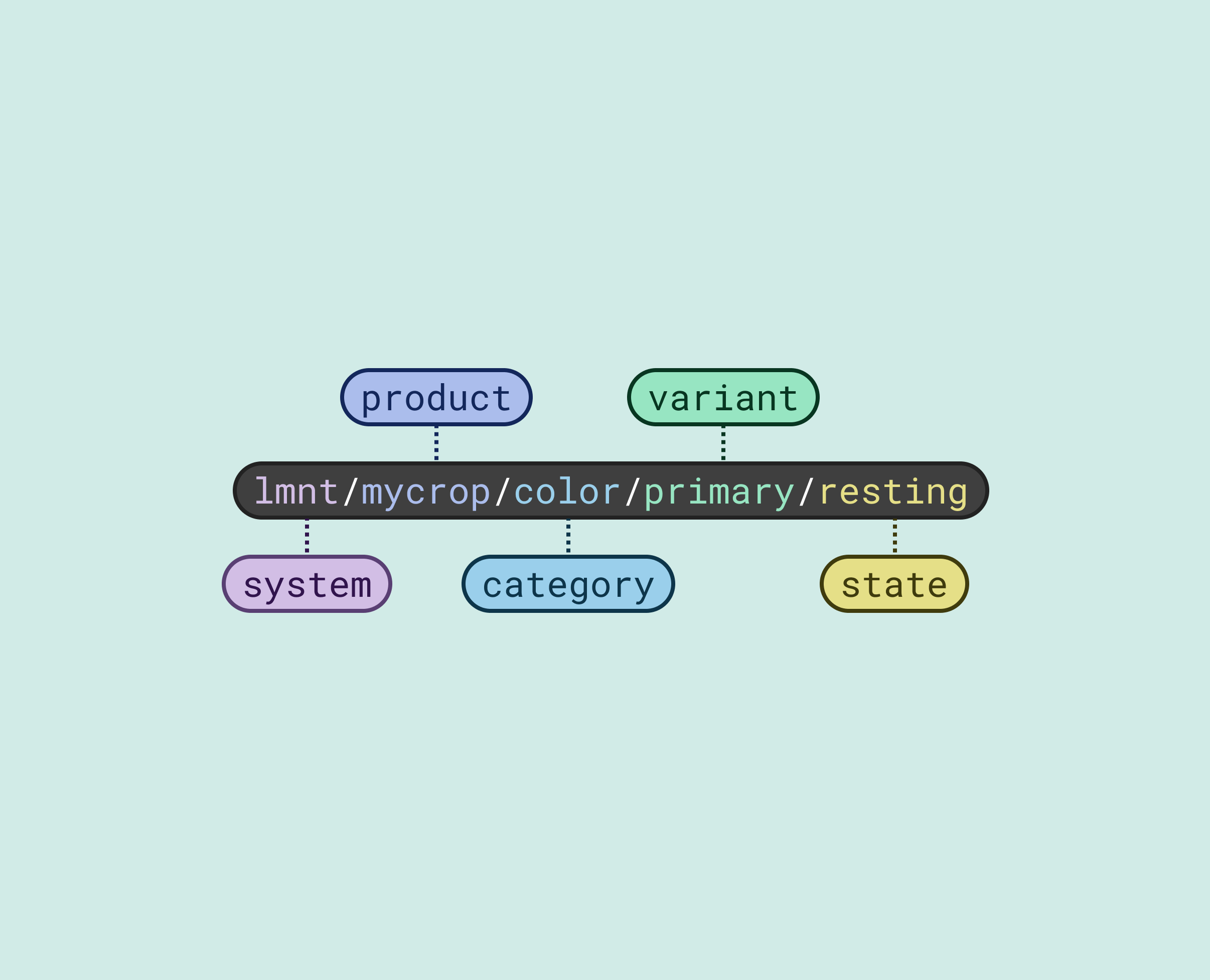
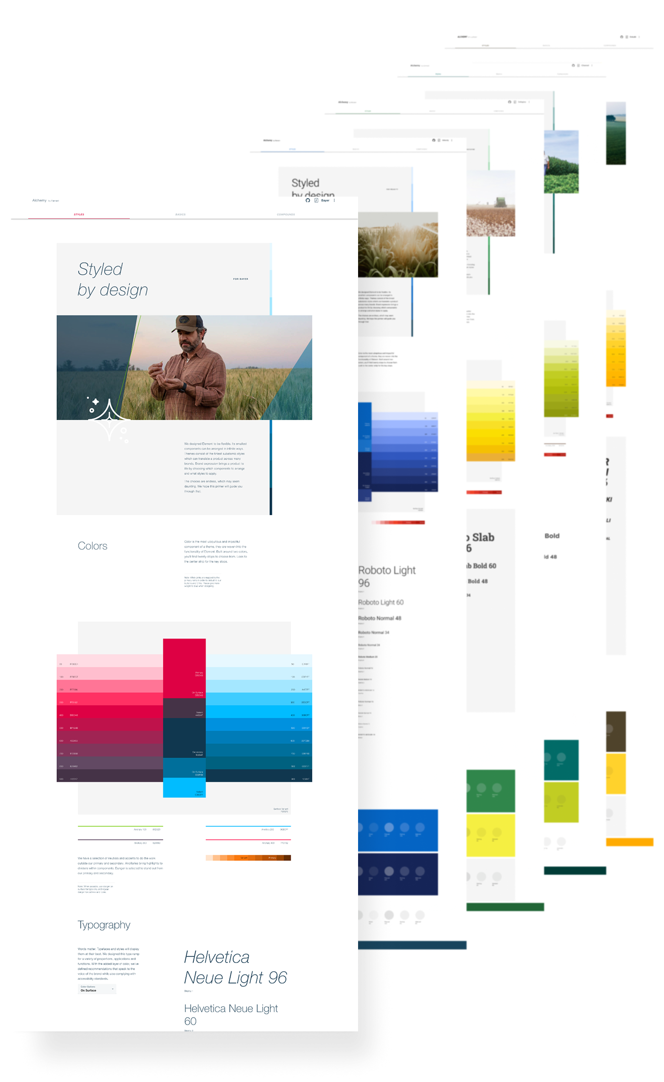
Design Tokens
Introducing semantically named Design Tokens into our system allowed us to standardize naming conventions between design and development, improving hand-off, improve Design System usability, and reduce cognitive load through simplification.
Theme Guidance and QA Tool
Best Practices & Documentation
Quickly view any theme
Brand Guidelines within Element
WCAG Compliance Type Documentation
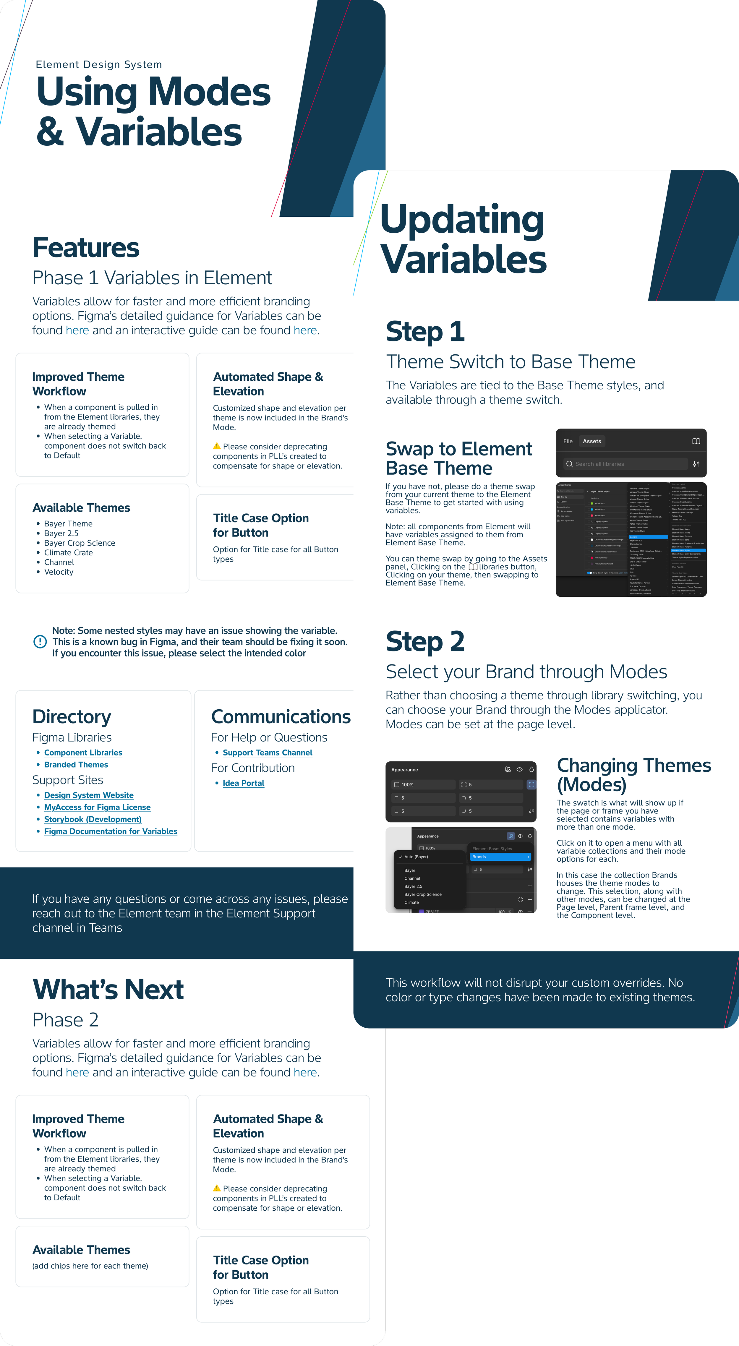
Theme Creation Tooling
Quickly peer review theme in design and code for parity and quality control
Test states per theme
Quickly showcase theme in experience for Stakeholder approval
Tutorials & Workshops
Go-at-your-own-pace videos and file examples for anything from getting started or commonly encountered problems
Hands-on Workshops to tackle challenges holistically
These resources were an easy entry point to track metrics
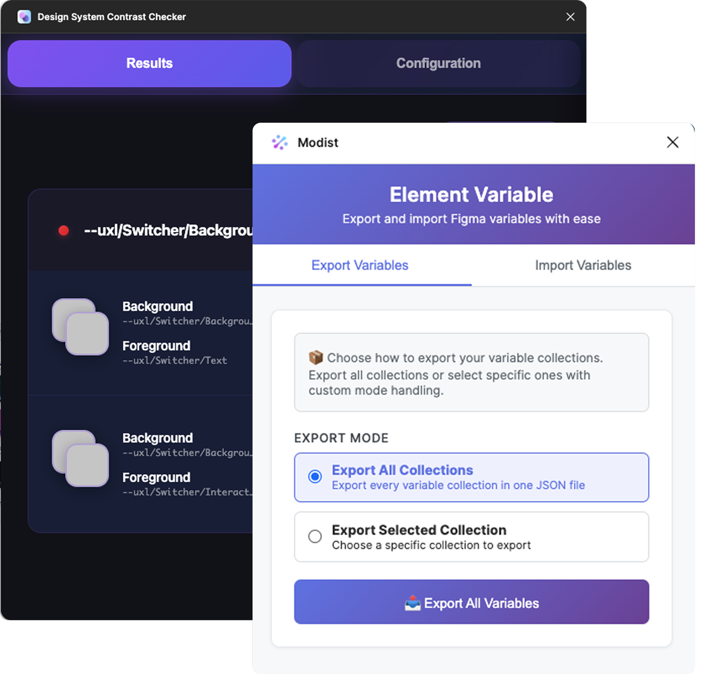
Accelerating Productivity with Custom Plugins
Modist - JSON Styles Converter
Quickly turn any theme into an exportable JSON file to be converted into dev-ready styles.
Design System Contrast Checker
Checking for WCAG contrast was one of the most tedious aspects of theme creation. This plugin could check every background and foreground color in seconds.
Winning MomentsSatisfied Users
Built trust between Design and Brand Managers
Element now boasts over 100 themes supported with WCAG compliance
Lessons LearnedInflexibility will create blockers for users
Too much flexibility will result in inconsistencies and chaos